Instagram changed its logo after a decade, and users began to criticize it severely
Published Aug 15, 2026 | By Nouman Shakeel
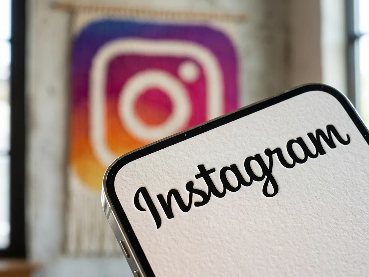
Social media platform Instagram has changed its logo after more than a decade. However, as soon as the new design was introduced, users started criticizing the company.
The company has replaced the old wordmark used for the app with a more rounded and modern design. According to Instagram, the new logo aims to make the platform’s visual identity more modern and prominent.
Announcing the new design, Instagram’s head Adam Mosseri said that the more than a decade-old wordmark had started to feel outdated over time.
According to him, the new style is more modern and clear. However, it retains the look and simplicity of Instagram’s original design.
The reaction of social media users to this move by Instagram has not been very positive. Several users pointed out that ‘Instagram’ is now teaching some people Instagzam due to the new font and shape of the letters, which makes it feel as if the company has added a Z to its name.
Other criticisms of Adam Mosseri's post also emerged from users, with some calling the new design an opportunity to question Meta's priorities.
Thus, a minor visual change sparked online debate and sarcastic comments on Instagram.